

Objectives & Goals
Creating a user-friendly that ensures a hassle-free cashback experience.
Boost the reliable platform
The Process
Discover
Define
Ideate
Design
Discover
To gain insights into the current user experience, I collected feedback from 40 users on Trustpilot. Through their reviews, I identified seven recurring pain points:
Users felt deceived by unexpected membership charges.
Lengthy waiting times and no automated tracking for payouts.
Lack of transparency in cashback tracking.
Complex and confusing withdrawal process.
Retailer restrictions on cashback redemption.
Missed cashback due to incomplete purchases.
Frustration from unclear payout rejections.
To address these pain points, I focused on three key user flows: sign-in/sign-up, making a purchase, and waiting/validation. Conducting four user interviews provided valuable insights into the user experience during these flows.
Define
To improve the existing product, I employed the Customer Journey Map to visualize Eva Huang's fictional journey as a TopCashback customer. This allowed me to identify pain points and and areas for improvement.
Based on the collected feedback, I formulated the problem statement and HMW:
‘How might we design a cashback website that provides a simplified and intuitive user experience, clear instructions, professional guidance, timely status updates, and easy access to cashback opportunities?‘
Competitive Analysis
As I reached the end of the definition process, I gained a better understanding of the goals, objectives, and requirements for the TCB case solutions. This allowed me to conduct a thorough analysis of four cashback platforms: Capital One Shopping, Swagbucks, MyPoints, and TopCashBack.
I mainly focused on exploring their features and usability to see how they compared. By identifying potential gaps and drawing inspiration from these platforms, I was able to shape my ideas and solutions effectively.
Click here to see the complete Analysis
Ideate
Brainstorming
With the problem statement and HMW (How Might We) in mind, I dove into brainstorming sessions, where I generated many creative ideas.
However, I had to prioritize tasks using the Kano model due to limitations. This allowed me to tackle the most crucial challenges and fine-tune the user experience for optimal results.
Design
Design Principles
The Design phase began by establishing a design Principles that prioritized professionalism, trustworthiness, simplification, clarity, and notifications/instructions.
Professionalism and Trustworthiness: The platform's interface and UI should convey a professional and trustworthy image to the users to increase their confidence in the platform.
Simplification and Clarity: The interface should be simplified to reduce complexity and increase clarity. Information architecture should be clear and intuitive, making it easy for users to find what they need.
Notifications and Instruction: To keep users informed about their order status and other important updates, the platform should implement notifications and email reminders.
Sketch
During the design phase, I created multiple sketches to address various design problems. One major challenge involved enhancing trust and reliability for new users on the Topcashback website.
To overcome this, I proposed a significant change to the current Topcashback Landing page. The solution involved providing comprehensive information about the website's services, including tutorials and user feedback, to increase reliability and help users minimize their learning curve.
Lo-fi
Medium-fi
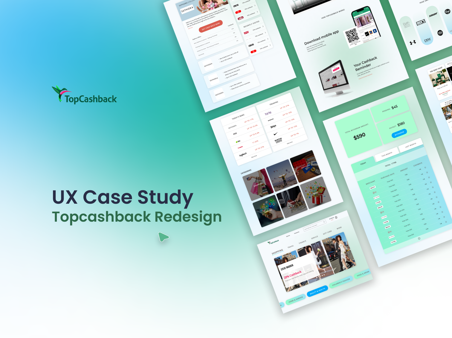
Here is the final design: Seamless cashback experience, instilling trust and reliability among users and empowering users to engage confidently and enjoy a more intuitive and user-friendly interface.

Landing Page
Before
After
Homepage
Before
After
Category Page
Product detail Page
Before
After
Page Redirect Notification
Before
After
Account Overview Page
Before
After


